

Swatch:
Award:
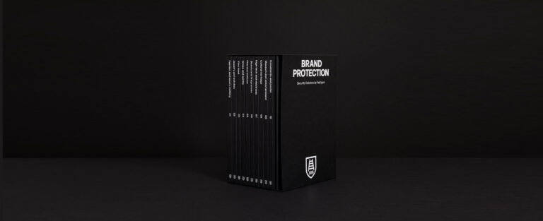
Competing Projects 2021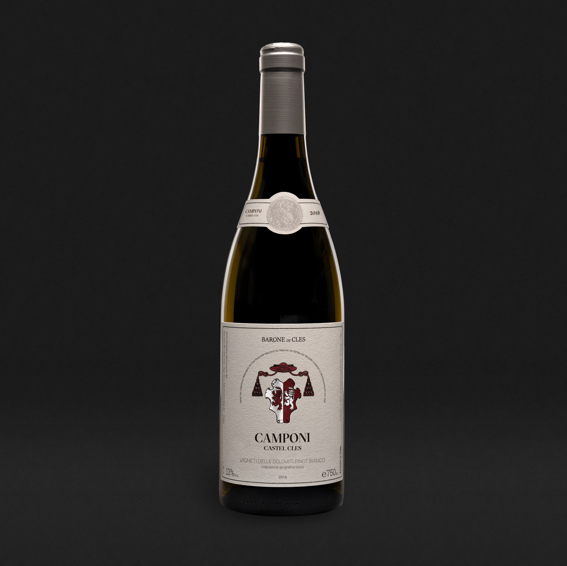
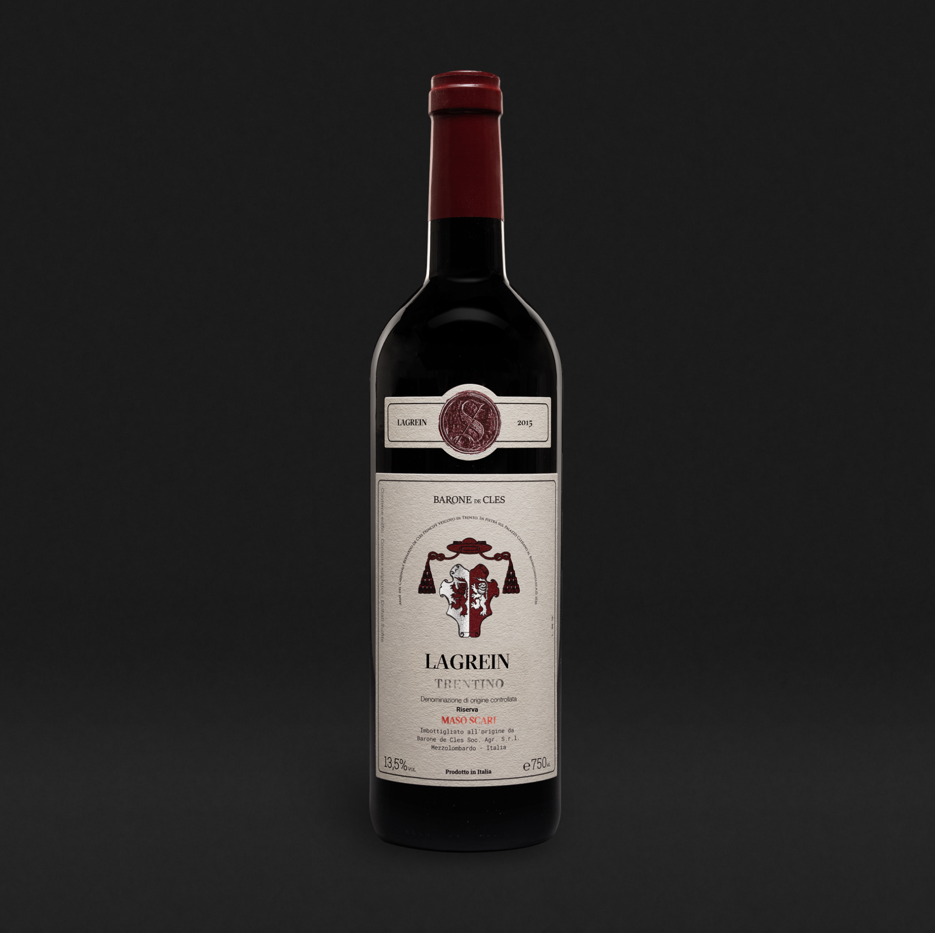
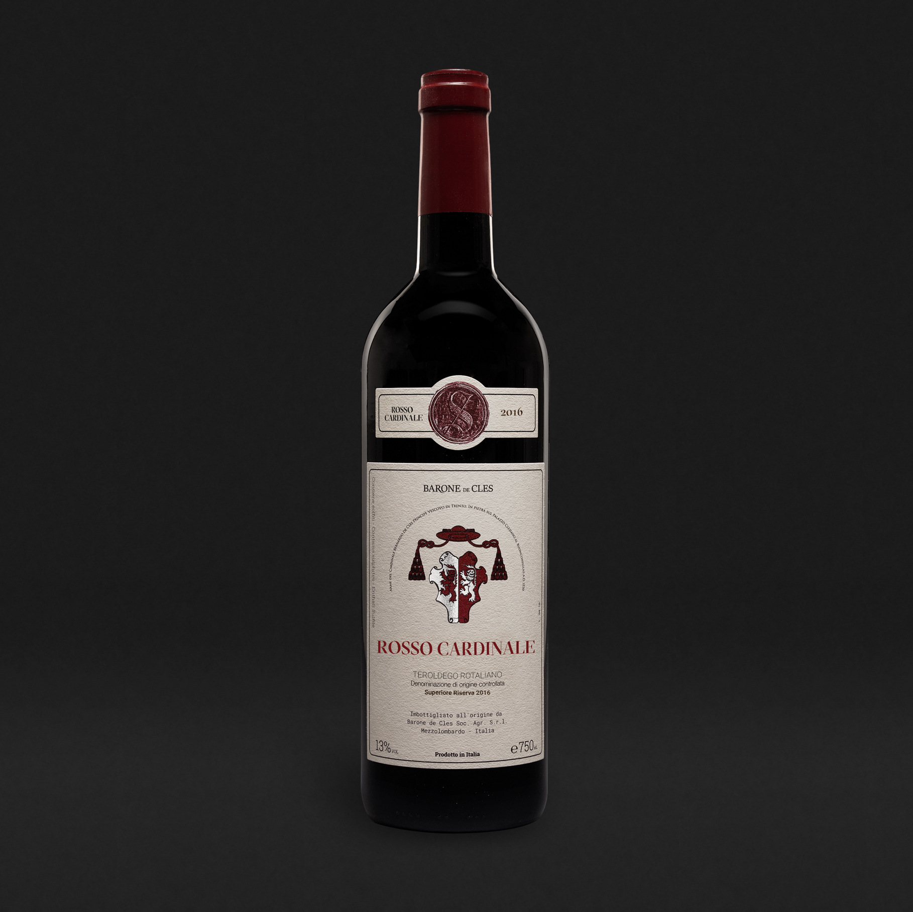
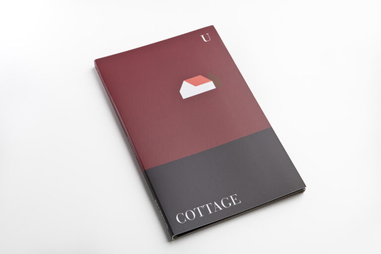
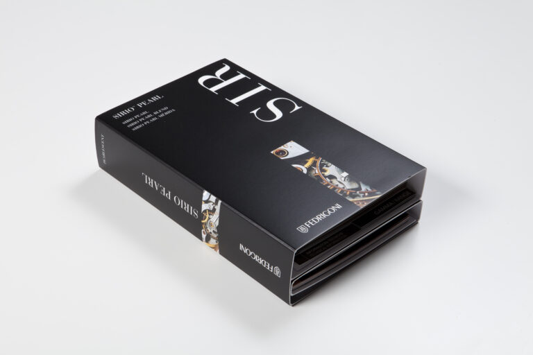
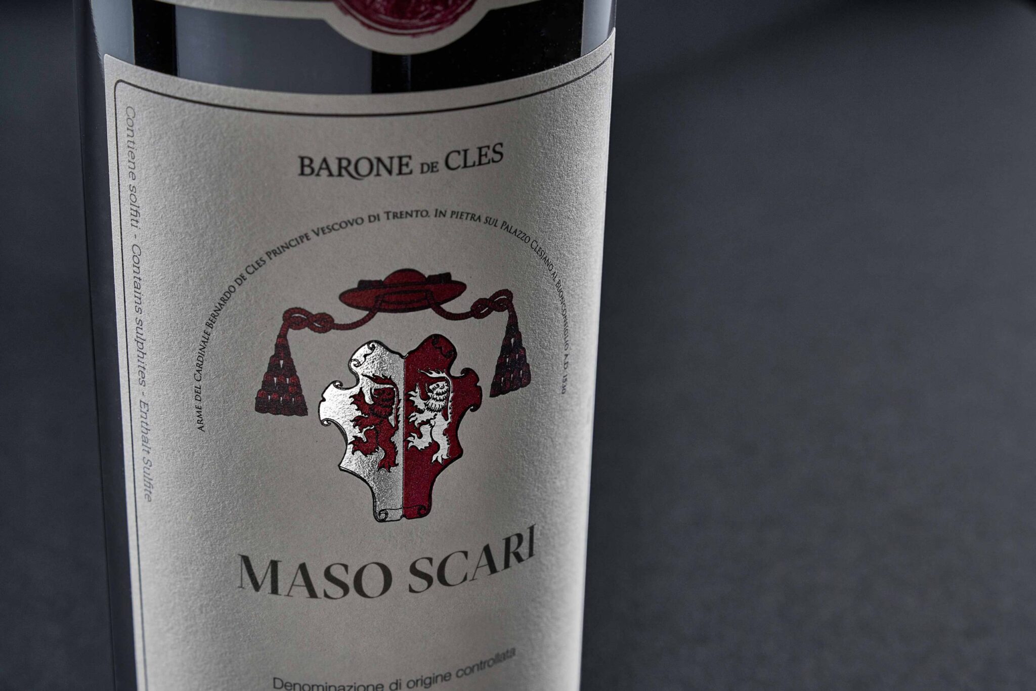
Labels
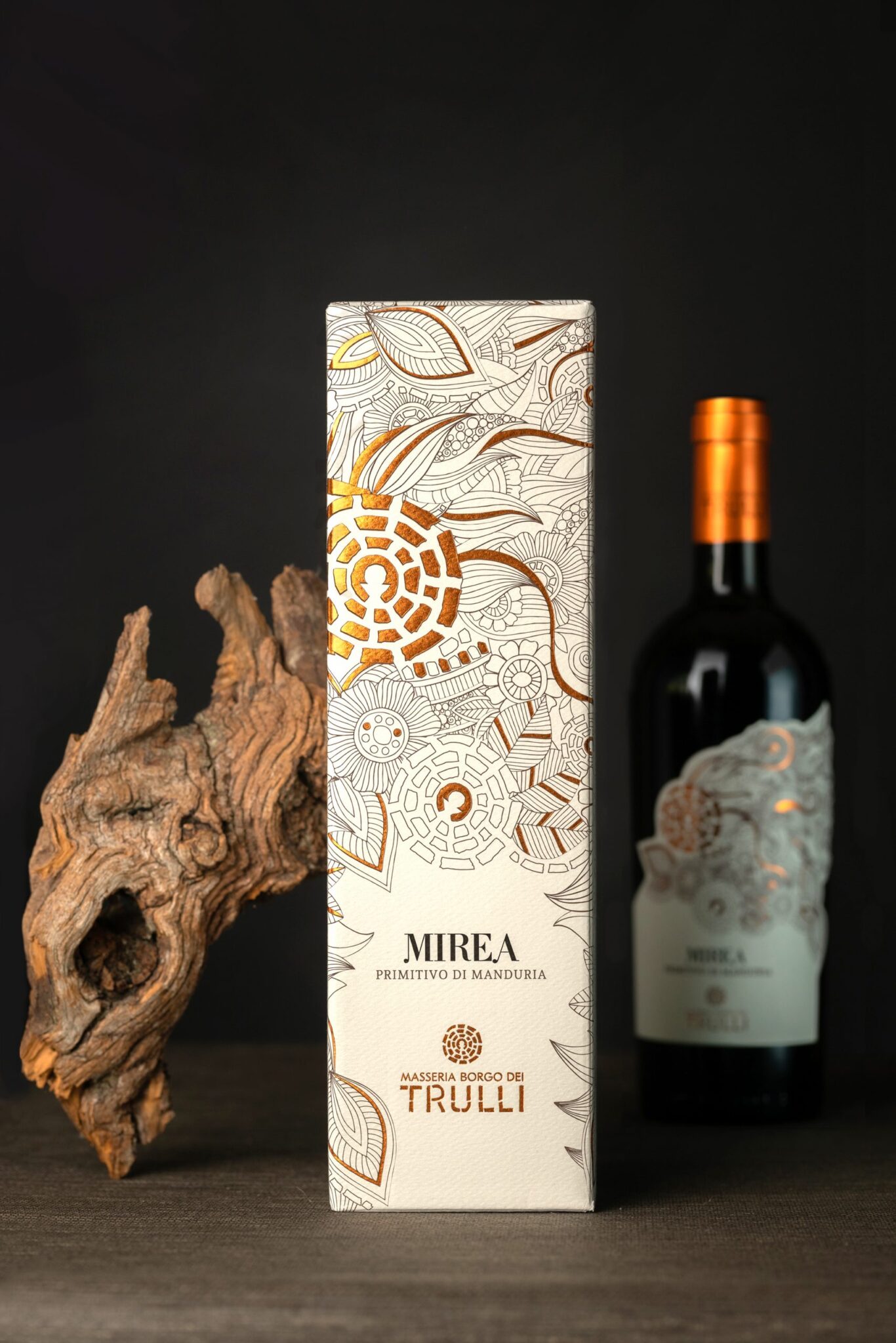
Labels are used to ensure recognisability of containers and to identify the brand and the product inside. However simple they may seem to be from a structural point of view, labels often have to respond to precise standards, especially in the field of food products and cosmetics. Their dimension must not only be proportional to the size of the container, but must also allow clear and legible presentation of the product information required by current legislation. In order to create a label with the best possible visual impact, secondary information can be included in a label applied to the rear of the product.
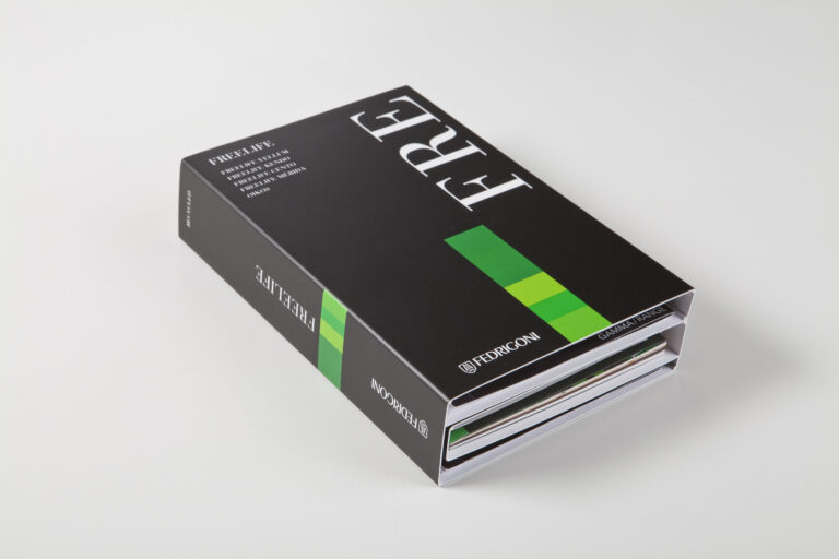
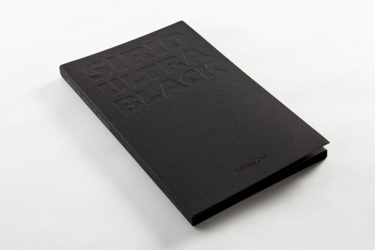
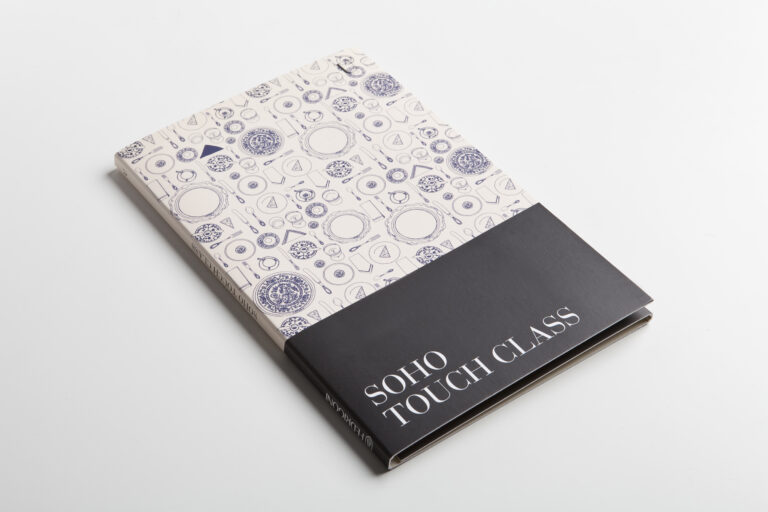
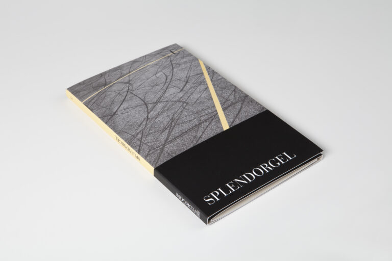
Printing and specialty Printing
Offset printing is one of the most common techniques used to achieve optimum quality for images and text. The name of the product is often highlighted with printing techniques such as embossed printing and hot foil stamping. The latter is generally used to obtain very realistic metallic colours that are very difficult to achieve with other printing techniques. If the board or paper chosen for a package has dark or bright colours, screen printing allows the application of covering inks that can be highlighted against the background.
Gebruikt papier:
Materica
Recycled Offer
Uncoated Colours
Acid Free
Cotton
ECF (Elementhal Chlorine Free)
FSC® Mix
Heavy Metal Absence
Long Life
Ph Neutral
Recycled content (Selected Secondary Fibers)
Gelijkaardige cases: